Mac OS X White/Light Text
Sub-Pixel Antialiasing Bug
Filing a bug is only slightly better than sacrificing
a chicken when it comes to fixing these problems.
Mac OS X uses sub-pixel antialiasing to improve the clarity of text by taking advantage of the additional "resolution" provided by the predictable red-green-blue ordering of the liquid crystals in LCD screens (unlike the phosphors of older CRT screens, whose order varies). Although it's not as effective as a true resolution increase, and it's limited to the horizontal dimension only, in general sub-pixel antialiasing works well and enhances text readability, while causing only an extremely slight, practically unnoticeable color fringing at the edges of the letters. It's a very clever trick, and a good idea.
Unfortunately, there's a major bug in Mac OS X's sub-pixel AA rendering for white/light text on black/dark backgrounds.
I first noticed this bug back in the 10.2 days, but sub-pixel AA wasn't the default back then (and I assumed problems like this were the reason why), so I didn't report it. Then when 10.4 came out in 2005 I reported this bug to Apple, since sub-pixel AA was now the default for all LCD users. It's bug ID 4309950 if you're interested, named "Sub-pixel antialiasing of text looks terrible in white-text-on-black situations".
Nothing happened for a year after my original bug report, so I then followed it up with lots of specific examples, and requested that the bug's priority be raised ASAP. Still nothing happened for what's now been another 9 months, so in desperation I'm posting here (and on Ars Technica). Hopefully the text guys at Apple might read it here, as my bug report is obviously not getting through using normal channels. :-(
I won't post the entire bug report here, but this one set of examples should be more than enough.
The left column is the default prior to 10.4, and has no sub-pixel AA. The right column is the default from 10.4 on, which now uses sub-pixel AA at a "medium" level. Note that you need to re-launch apps for the change to take effect.
 |
Here (above) we see the way sub-pixel AA is supposed to work, and it does work well. It makes for a slight improvement because of the increased "resolution" that the sub-pixels give you. It's particularly noticeable on diagonals (v, w, y) and curves (a, e, o, p, s). The price you pay is only a very slight, practically unnoticeable color fringing at the edges. Most importantly, the effect is only subtle – it improves but doesn't drastically change the look of the text from its natural form without sub-pixel AA. This is correct behavior.
 |
Here (above) we see the bug. The right version, with sub-pixel AA on, is a LOT heavier/bolder than the left version without sub-pixel AA. I believe the bug is that the strength of the sub-pixel AA is being calculated as if the text were black/dark and the background white/light (or something along those lines). As a result, the sub-pixel AA'd edges (which would fade into the background on white) end up "fattening" the letters, making them all look heavier. For normal text (gray, lower), the result makes the text look almost bold. For the top paragraph, which really is bold, the buggy sub-pixel AA makes it look super-bold. The sub-pixel AA is accidentally making major, drastic changes to the way the text looks, which it doesn't do in the normal black-text-on-white cases.
Now you might say the right version looks better, and I agree. There IS a good case for slightly fattening small lettering when it's light and the background is dark, to make it more readable. Perhaps Mac OS X should do that for small text sizes. That would be a logical choice, and apply no matter which AA mode is chosen. But that's not what's happening here. This is not an intentional thing – if it were, the left version would also be heavier. What we see here is an ACCIDENTAL side-effect of calculating the sub-pixel AA implicitly assuming black/dark text on a white/light background.
 |
Here (above) is a more severe example, taken from the HardOCP web site. All of the text now looks bold if sub-pixel AA is on, and the bold heading looks super-bold. The main text here is NOT bold text, it's just regular plain Helvetica/Arial.
 |
This example (above, taken from the Tech Report web site), and the previous, take one of the biggest hits from this bug, since they use quite large text so they don't really benefit from any accidental fattening of the letters. It just looks like the whole site is bold (which it isn't).
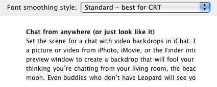
Note that you can reduce the degree of the bug by choosing "light" sub-pixel AA in the Appearance preference pane, but that doesn't completely eliminate it. And of course, it reduces the effectiveness of sub-pixel AA in the common, black-text-on-white-background case. Turning sub-pixel AA off by choosing "Standard - best for CRT" mode is currently the only way to avoid the problem, and that kind-of defeats the point of HAVING sub-pixel AA options. :-(
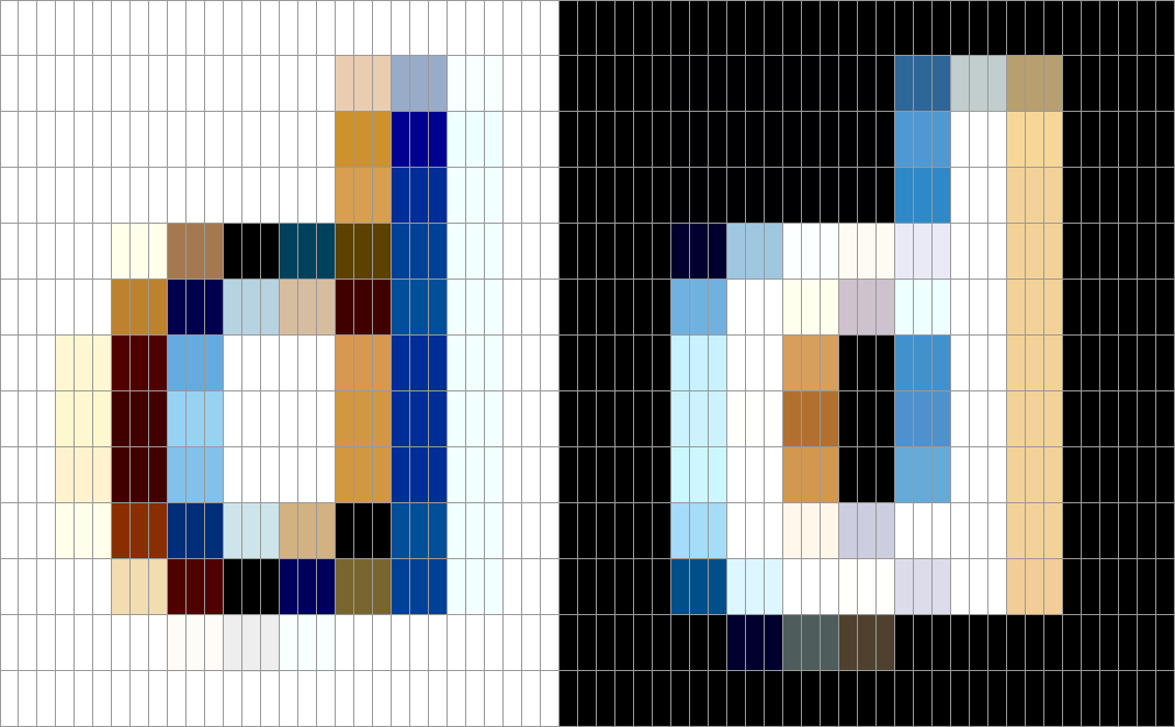
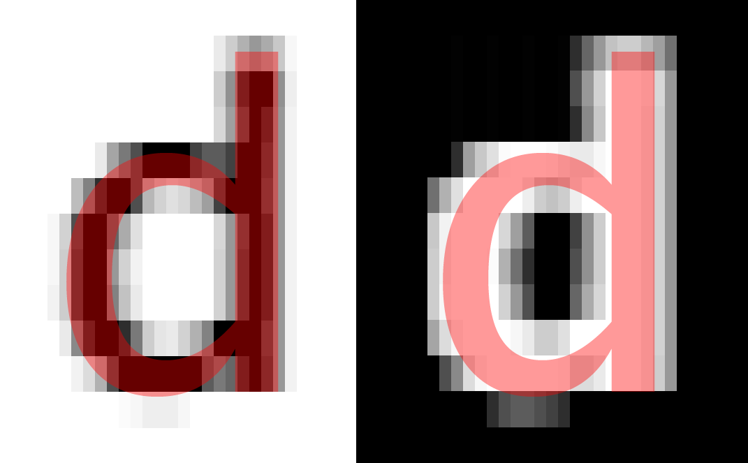
So let's not just imagine what might be going wrong at the sub-pixel level – let's really check it out. Here's an extreme close-up of the letter "d", in both cases (white and black backgrounds). These are the actual pixels that the OS draws, with Quartz set to the "medium" sub-pixel AA setting, which is the default for all LCD monitors from 10.4 onwards...
 |
Now obviously this looks ridiculous when scaled up, but bear with me. First, let's superimpose a grid to delineate the sub-pixels...
 |
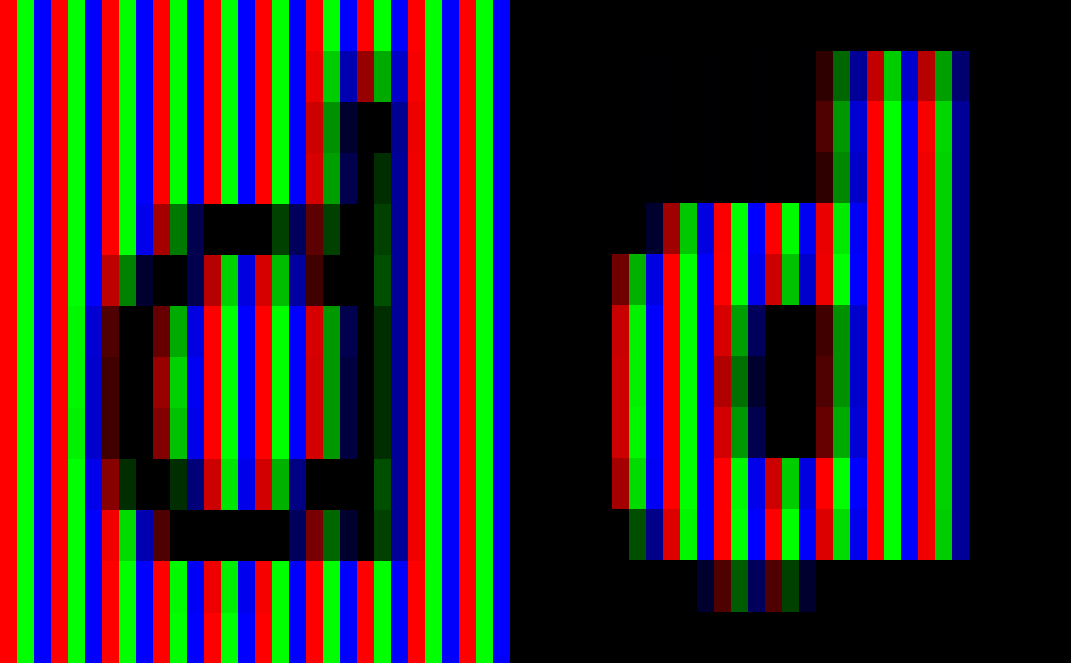
Nothing too exciting yet. But of course each pixel is really 3 sub-pixel liquid crystal elements, one for each primary color. So let's overlay some RGB columns, set to Photoshop's multiply blending mode. This is where it really gets interesting...
 |
So that's what is actually shown to our eyes. Hmmm. It starts to show the problem, but it's a little difficult to understand from a human perspective, because we're used to having our eyes/brain automatically combine the reds, greens and blues into white and various grays (and other colors). So let's do that. A Channel Mixer layer in Photoshop does the job nicely, turning each pixel from x/0/0 to x/x/x, and similarly for 0/x/0 and 0/0/x...
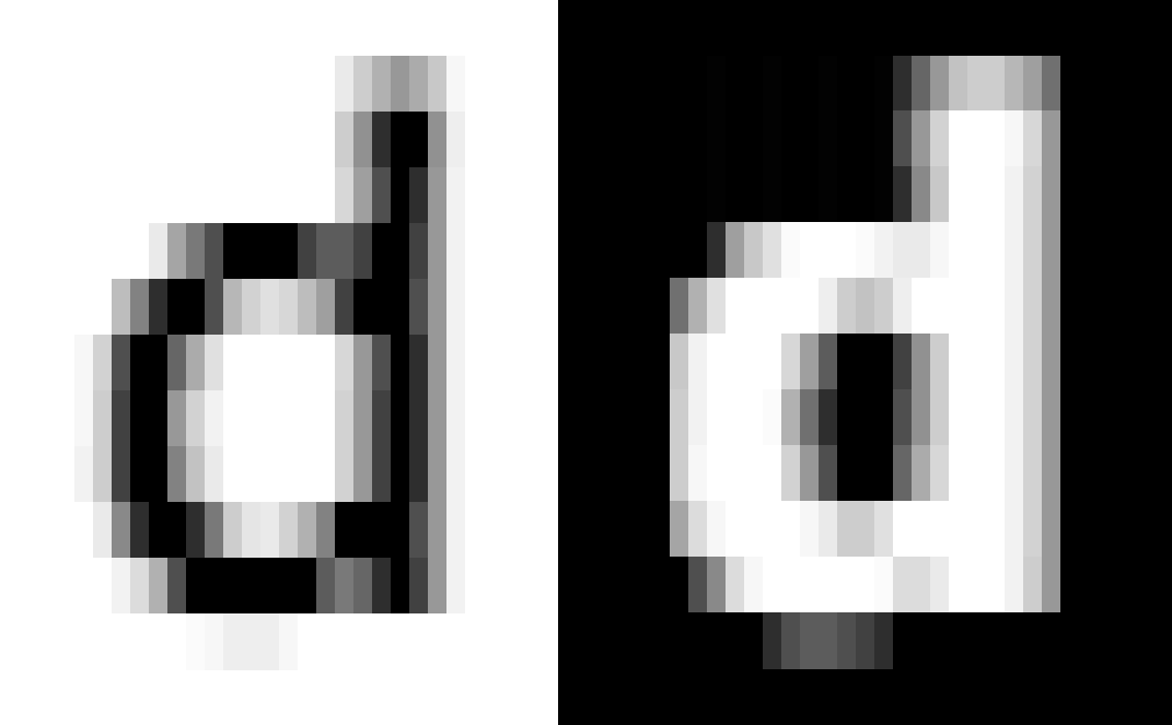 |
This gives us a pretty good approximation of what our eyes/brain sees when we view the image. It's not perfect, but it should be pretty close. And indeed, the Photoshop icon for this file looks amazingly similar to the real "d" when scaled to the same size (in both cases).
Now the problem is quite easy to see. On the left the AA fades from the text color (black) to the background color (white) relatively quickly and smoothly. This makes sense, since the letter shouldn't be contributing much ink to sub-pixels far away from the "strokes", so they should be mostly the background color.
On the right we see the bug. The AA fades very, painfully, excruciatingly slowly away from the text color (white) towards the background (black). It does fade towards the background, so my simple explanation (earlier) isn't 100% correct. But still there's definitely a problem with the strength calculations. Also, in many cases there's a very abrupt jump from almost white straight to black, which is clearly wrong.
Take the rightmost sub-pixel of the main vertical stroke. On the left, it's 242, which is very close to the background of 255, meaning its strength is a mere 255 - 242 = 13 (or 5%). On the right, the same sub-pixel is a whopping 152, which is a full 152 away from the background of 0 (a strength of 60%). How can the same sub-pixel be 5% on in a black-on-white case, and 60% on in a white-on-black case? I think it has to be a miscalculation, and it's a miscalculation not of the sub-pixel positions (which are the same, more or less) but of their strengths (which are very, very different).
Lastly, here we see an overlay approximation of the "true" letter which is supposedly being drawn...
 |
... which shows just how wrong the right hand version really is. Crikey!
I realize (and mentioned) that intentionally fattening the letters might be a choice Apple are making. But if that's the case, why isn't the text also being fattened in the case where sub-pixel AA is turned off altogether (from the original examples)? And why apply it even at large sizes, where it does more harm than good? And why go to special effort for dark backgrounds only to finish up with critical things like the menu selector looking bad? I really doubt any programmer at Apple deliberately did this, tested it and decided that was a good result for dark backgrounds. So I really doubt it's intentional. I think it's accidental.
Let's just hope someone from Apple is watching. :-)
Downloads
You can download the Photoshop file of the letter "d" close-ups if you wish.
Acknowledgements
I'd like to thank Matthew Kirkcaldie for participating in the Ars Technica discussion and prompting me to look into this bug in more detail.